When it comes to digital marketing, you need to stay on top of trends to stay ahead of the competition. In the past couple of years, the biggest trend that has emerged is largely responsible for transforming how we use the internet: search engines have jumped on the mobile-first indexing bandwagon. With the undoubtable number of users that now access the internet through mobile devices, this is a change we all need to stay on top of. Understanding what it means to be optimised for mobile-first indexing is essential for businesses, marketers and anyone who wants to rank higher on search engines and ensure their online presence can be found. This article explains what it means for you to make the leap to mobile first.
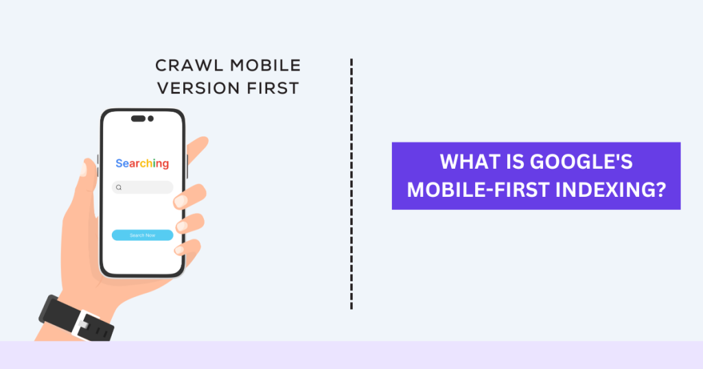
The Evolution of Mobile-First Indexing
Mobile-first indexing introduces a radical shift in the way that search engines index and track content of websites. To begin with, it’s important to note that up until fairly recently, search engines like Google indexed and ranked websites based on their home page and internal pages. In other words, the search engines replicated each website on their servers as you would see it on your desktop. This approach to indexing reflects the time before the dominance of mobile internet. The percentage of mobile internet consumption hit half of all internet usage by 2016, and it continues to grow today. Most businesses began optimising their websites for mobile in 2018. Google changed the approach for index-ranking websites to reflect the mobile friendly nature of the web. For the most part, Google now uses the mobile version of a website for indexation and ranking, which means that businesses are accountable for their mobile websites.
The notification of mobile-first indexing isn’t just a technical change: it’s also a response to shifting user behaviour. With more and more people moving towards consuming the web on smartphones and tablets, search engines want to provide the best experience possible while customising the index to fit user devices. What this means is that, if your website wants to rank well, search engines want it to be designed with mobile users in mind, from speed to ease of navigation. Mobile-first indexing is a teachable moment about the importance of designing a website with the mobile user in mind, something that’s become a necessity for contemporary digital marketing.
Understanding the Mechanisms of Mobile-First Indexing
With mobile-first indexing, the mobile version of the site serves as the baseline for content inclusion in the index and the basis for ranking within search results for both mobile and desktop devices. If there isn’t a mobile version, a desktop-only site will still index, but its lack of mobile-friendliness might take a hit to search rankings, leaving the site less visible in the mobile SERP. To their sites and, by extension, to their SEO.
In mobile-first indexing, Google crawlers access and evaluate the mobile version of a site more often than the desktop version. Prioritising mobile-first indexing is likely to give a more prominent role to mobile usability issues, such as slow load times, poor navigation or unreadable content, in determining how well a site performs in SEO. Majoring in mobile means minor flaws in mobile site access and hygiene could wind up having a major impact on its SEO performance, leaving web developers and SEO practitioners little choice but to ensure that the mobile presence replicates the desktop site’s full functionality and usability if they wish to remain relevant at a rankings level.
The Impact of Mobile-First Indexing on SEO
The switch to mobile-first indexing presents greater challenges for SEO tactics. Perhaps most importantly, it means that mobile site speed is now more important than ever. Pages that take a long time to load are more likely to annoy users and cause higher bounce rates, which will hurt rankings. Google’s own PageSpeed Insights tool can be used to find areas for improvement, such as optimising images, decreasing server response times and leveraging browser caching. A fast, smooth mobile experience is imperative if you want to maintain or improve your search rankings in a mobile-first world.
Another key factor is responsive design. That is, websites that automatically adapt to be viewable on a range of screen sizes and orientations are far better suited to the modern user experience than sites that remain static and may or may not be resizable. Improving site usability like this can help reduce the numbers of users encountering problems when they attempt to visit a site on a mobile device. Mobile-first indexing also puts a greater emphasis on the readability and usefulness of a site’s content in its mobile view. Text should be big enough to be readable without zooming, and buttons and links should be large enough to be easily tappable. These are another couple of very simple considerations that need to be given more attention if your goal is to improve your SEO performance under mobile-first indexing.
Best Practices for Adapting to Mobile-First Indexing
The best practices for making the transition to mobile-first indexing include maintaining a functional copy of your mobile site that parallels your desktop site by having the same content and features, and the same metadata, alt text and structured data. Any difference between your mobile and desktop sites will make for a worse user experience, and thus, lower positions in search results.
Another vital practice is to optimise for mobile usability: ensure handheld devices see a slimmed-down and simplified navigation for easier discovery of the things people seek; showcase clear, concise copy that reads perfectly without the need to zoom in; and use easy-to-hit touch-friendly design elements such as large buttons and tappable links. Regular testing on a whole host of mobile devices and viewport sizes is a must to peel away any usability wrinkles so that your website is just as user-friendly as it is beautiful.
Common Challenges in Mobile-First Indexing
Notwithstanding the advantages of mobile-first indexing, serious issues could particularly plague sites that haven’t been properly optimised. For instance, if the mobile version of the site lacks content, features or metadata found in a desktop version, the site could wind up in the doldrums of rankings. Likewise, algorithms won’t score any positive points when it comes to a site’s performance, so it’s important to make sure that both the desktop and mobile sites have parity, to avoid search-engine ranking penalties. Interestingly, another challenge raised was speed. The importance of a fast-loading site on mobile couldn’t be overemphasised, one participant said. Large images, unoptimised code and slow server speeds could be substantial impediments in mobile performance.
A second major challenge is maintaining standards of usability, and not allowing mobile-friendly design to compromise the user experience. On a smaller screen, navigation bars and sign-up forms have to look pretty, but work even better. Further complicating things, websites must adapt their designs to fit different screen sizes and orientations. This careful balancing act requires ongoing testing and re-optimisation of the mobile site to keep pace with the high standards expected by mobile-first indexing. It’s an iterative process – best practices and search engine algorithms are constantly evolving, and it’s down to us website owners to audit our sites regularly, and continually update them.
Future Trends and Developments in Mobile-First Indexing
With mobile-first indexing ubiquitous, we can expect future trends and developments along these lines to define our digital horizon. Perhaps the most obvious will be the further deployment of artificial intelligence (AI) and machine learning, helping to refine and enhance the mobile search experience. The device’s search results can be personalised depending on how you use a device, and machine learning can help it anticipate your needs. Growing sophistication of mobile technology – in the form of higher bit rates and faster processors – will also transform the mobile browsing experience.
Secondly, there is a growing reliance on the voice search. With the increasing use of smart digital devices including smart TVs and amazon echo, for example, more and more users will be searching on the web with their voice. This requires a different SEO approach – as the SEO practitioners need to pay more attention to natural language processing and conversational search. To prepare for this trend, it is necessary to keep ourselves updated with the new technology and constantly adapt SEO as the evolution of mobile users’ need.
Conclusion:
In conclusion, mobile-first indexing gains significance and relevance in the mobile-first world of digital marketing and represents a powerful tool for foretelling digital shifts. It is important to know how mobile-first indexing works, what it entails, and the best practices for incorporating it into a company’s website. This will allow them to engage with prospective new customers in meaningful ways while providing them with a great user experience, maintain their ranking in search results, and remain competitive in an ever-changing mobile-first world.